THE CEDAR LAKE KITCHEN
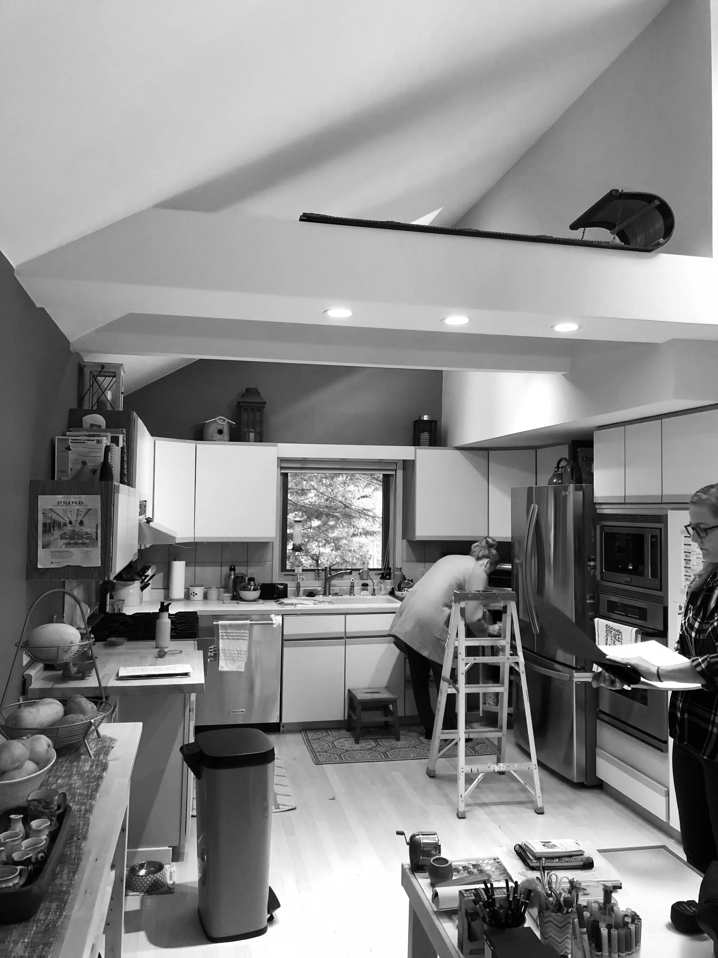
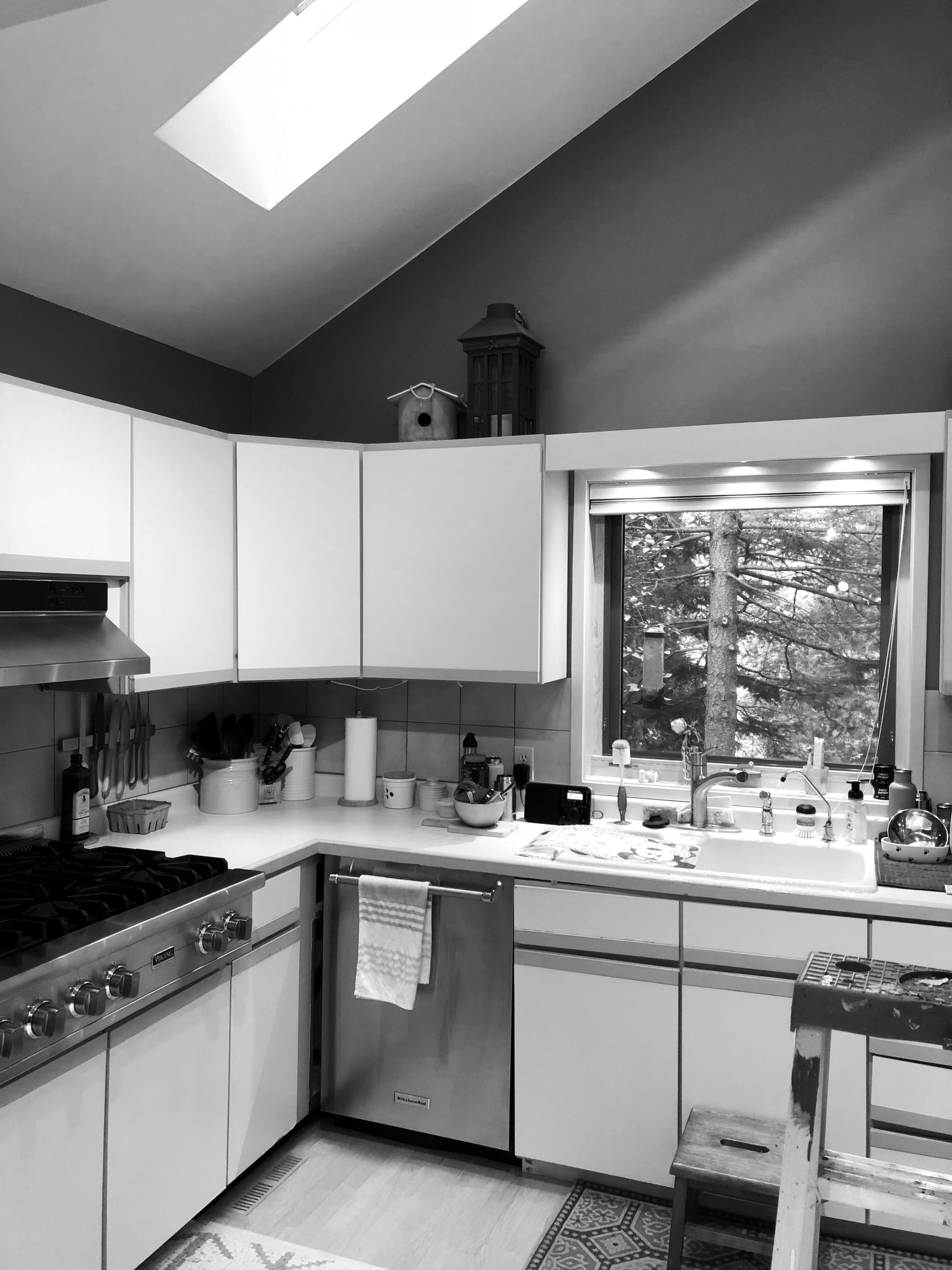
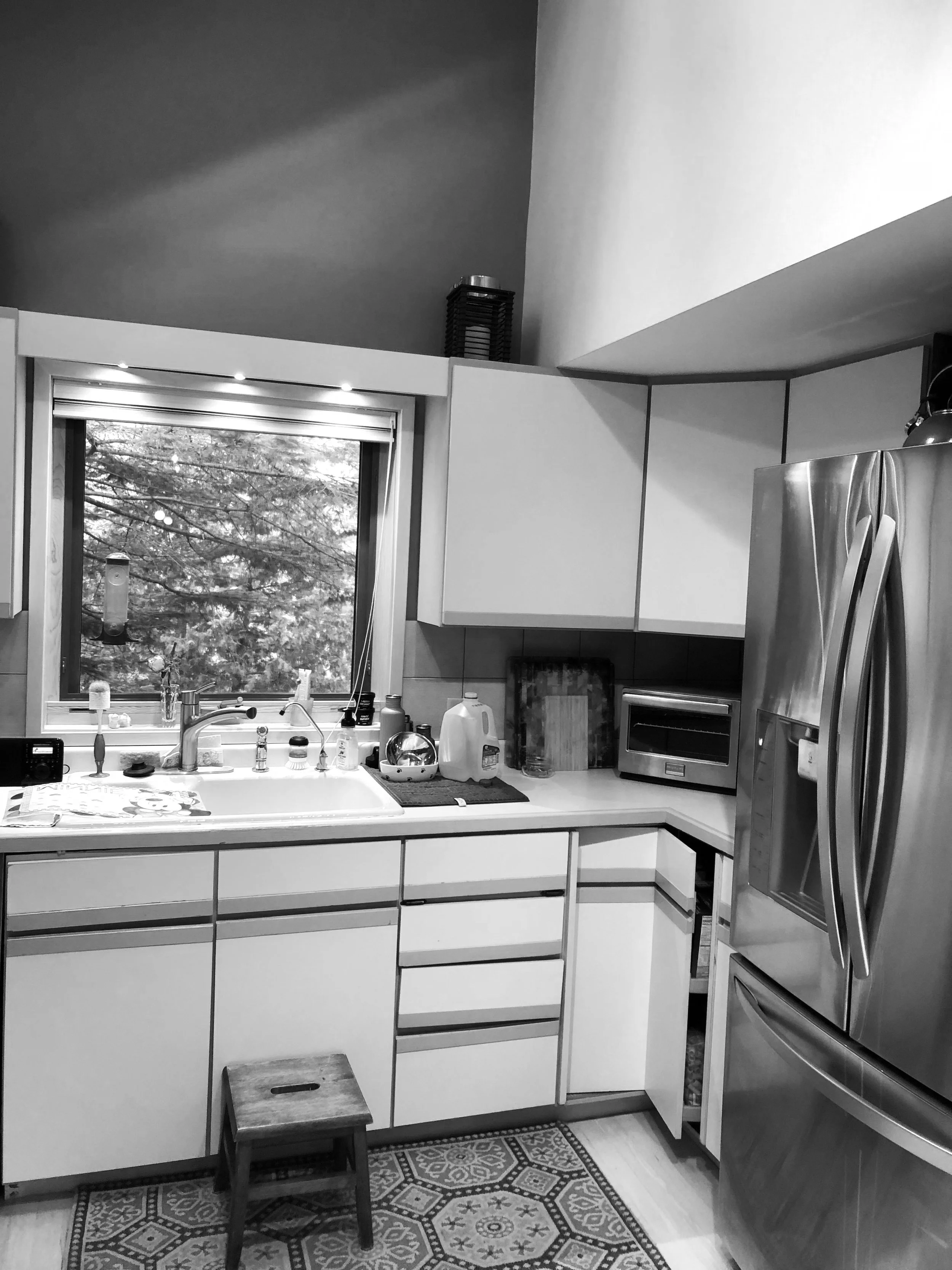
The open space of this kitchen lacked function and flow and had very little storage. Despite the high ceilings, the kitchen cabinetry was tucked under soffits which gave the kitchen a cramped feel. The homeowners wanted a more efficient space, upgraded appliances, and a Scandinavian aesthetic.
The angled ceiling that opened across the dining room and up to the second floor created a challenge to keep the space cohesive. To create a focal point from the living area a hutch was designed to flow into the counter space yet still feel like a separate piece. Raising the cabinets to the start of the ceiling’s angle added much needed storage.
White cabinetry, geometric tile, open shelves, and two cherry hutches with a driftwood stain add a cohesive, Scandinavian look that blends with the rest of the home.
Photography by Andrea Rugg Photography
CEDAR LAKE | BEFORE


